The Secret to the Right Product Packaging
It costs less to develop quality product packaging than replace damaged goods.
By investing in creating good, well-fitted, and rigid packaging from the beginning, you are investing in the future of your product. And, just like it is in most of the cases, it does look brighter if you invest resources on it — be it time-wise or money-wise — and do not let things just go their way.
Good packaging represents a marriage between practicality and beauty. It needs to be safe while attracting attention. People need to both understand right away how to use it and want to keep it.
But how do you create a great one? What do you need to do? What do you not need to do?
Those all are underwater stones we will be happy to tell you about in the article, so you do not have to.
As almost any production process, creating packaging comprises the three stages: before, during, after. We have divided all the larger steps into small sub-steps that would help you navigate the complicated and often confusing process.
Step 1. Making decisions
Product packaging consists of many, much smaller elements such as graphics, colors, fonts, copy, design. It is a matter of much smaller choices. But all of them need to mix into a palette to become the marketing masterpieces we can stare at for hours, feeling like we are making important decisions.
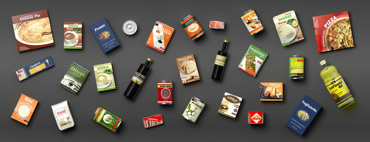
But just as you cannot shoot a movie without a plot or at least some idea of where you want to take it, you cannot start producing packaging without knowing what you need to be working at first.
If you feel confused about where to start — start with your product.
Logistics
Before you work on your product, consider how you will transport it.
The logistic of an online shop is so obviously different from the product that will be sold in the retail shops. Take that into consideration.
Make it easy to stack up against your product if it needs to be transferred in cars and other vehicles. Give it extra protection if it needs to be traveled distances. The decision about logistics and the location of your products will also affect the overall design of the product.
Remember about the 5P of marketing? The place is one of them. And since the packaging is considered being one of the marketing tools, you can’t design a campaign ignoring the important factor.
For who
Now it is time to understand your customers.
Your product has an end goal. It needs to reach your target audience and resonate with them. How can you do it? By designing a packaging that would speak to them.
Kids love bright colors and cartoon characters, and that is why most products targeted at kids have those two elements. The luxury segment is filled with products that do in darker shades and metallic prints.
It is no coincidence. We subconsciously associate those elements with the category of products, and it is the expectation most consumer goods companies have played with well.
So, since your packaging’s main goal is to attract new customers, giving them a preview of what their experience with the product will be like, understand who you are and how your product might help them.
Now, to your product
Next comes the product itself. While you would probably think you know your product better than anyone else and you probably do when deciding a packaging you need to look at with new eyes.
What is its size? How long is its shelf life? Do you have special certifications you need to display? It will all affect your packaging. So be diligent and answer those questions thoroughly.
Step 2. Designing the product packaging
Now it is time to do what most of you would think about when they think about product packaging design.
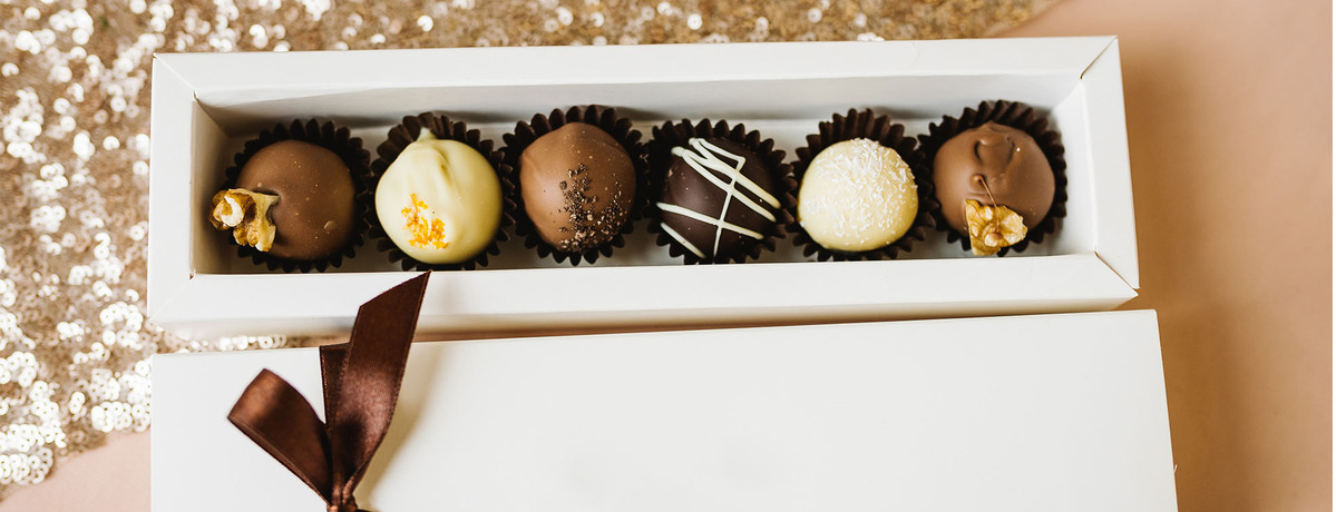
After you have understood the logistics, studied your audience, and learned everything there is to learn about your product, it is time to put the knowledge to use.
Set the tone
From an artist’s point of view, it is the most creative step in the process. After you have answered the questions above, it is time to work on the look of your product.
But before you go wild, let’s start with constraints.
- Set the budget (for better or worse the resources aren’t endless)
- Study competition (learn about the rules to break them)
- Create an inpo board (the ideas will help you guide throughout the process)
And after you have done that, you can start creating. Go wild, while still making sure you include the following things.
- Branding related materials: colors, font, logo
- Packaging related: copy, marks, images, temporary info
Remember how we said that packaging should be functional before it is anything else? Well, we stand by it.
When working on elements, do not forget about the whole picture. Make sure your packaging serves people, making their life easier. We will always find something to be frustrated about, and packaging should not be one of them. And our next point is exactly about that.
Design an experience
Apple’s products drive the world crazy. And just as much we like the products themselves, we like its packaging. I bet if you have ever owned an iPhone or purchased a MacBook, you still have the packaging somewhere around.
There are many reasons you might still have them around — you might hold the tech’s accessories in them or have repurposed the box for something else. But we are sure if the packaging was ugly and not as experiential, you would have hardly wanted to have it around for long.
In other words, Apple products packagings do their job exceptionally well. They introduce you to the product, becoming part of the experience. And it is not unintentional. The concept even has a term — it is called ergonomics.
Ergonomics is the science of human experience. It is the process of designing with people in mind. And it is not used only in relation to products — environments, systems and, you guessed it, product packagings are often done with the concept of people in mind. Well, good ones at least.
- Consider the layers (how many layers are there to a packaging? Does your product only need protective packaging? Do you need a gift bag? Or maybe your packaging needs an extra layer for protection)
- Type (Do you need a bottle? Or maybe a box?)
- Printing (How many copies of a product do you need? And based on the information, you can choose either offset or digital printing.)
- Information structure (how information needs to be displayed? What is the MOST important thing on your packaging — something that needs to be highlighted and catch attention)
Step 3. Testing your product packaging design
No matter how beautiful, if your packaging does nothing but confuses your customer, it will most probably continue confusing them on a shelf.
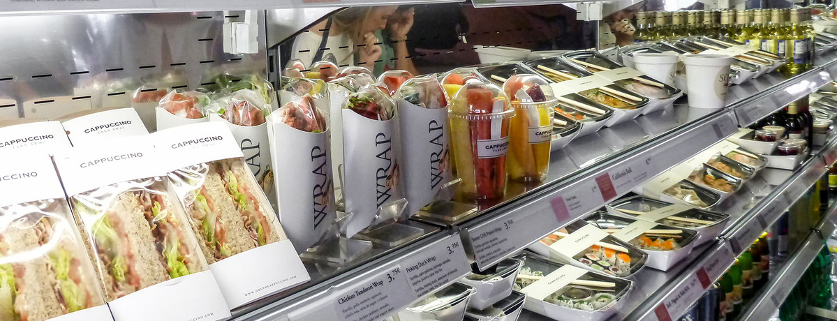
So, be careful when making creative leaps. They should not be done at the expense of comprehensiveness.
Follow this simple rule:
- Do not lie
- Test for clarity
- Does it work in real life and on images
- Understand how it will look in stores and on shelves
- Make sure it is scalable
- Aim for sustainability (and repeated usage)
And after you have considered all those points, do not forget to collect feedback. Ask everyone — your potential consumers and hear them out. You will be surprised by their insightfulness.
And before you leave — technical matters
Without the right file, you will most likely not get things done. All your hard work will go to waste, and the product packaging you have worked on so carefully will cost you priceless resources — be it money or time.
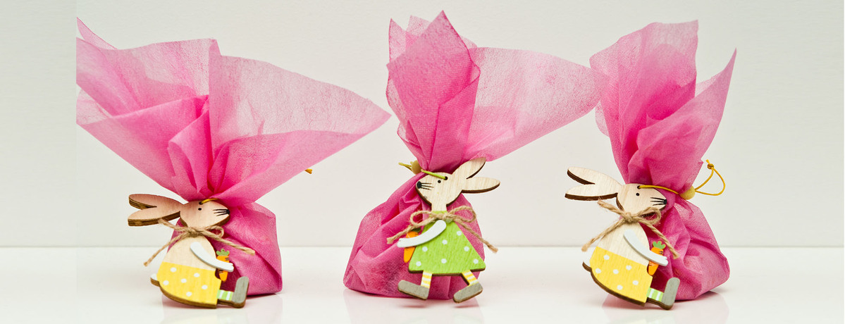
So, ask your designer for the right files:
- Packaging files (vector format) – PDF, AI files, etc.
- Color codes
Print it. Place inside a product. And here you have it — the perfect product packaging, ready to take over the hearts of your customers.
